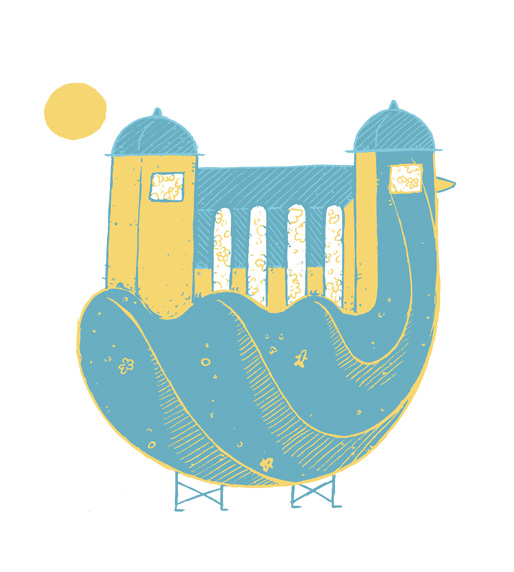
Shortly after completing my Penarth View cover illustration Penarth Pier Pavilion asked me to illustrate the newly refurbished Pavilion, along with two other talented local illustrators, Matt Joyce and Suzanne Carpenter.
This illustration has been printed on tote bags and postcards and are currently given to the first 500 Pavilion founder members as part of the welcome pack.

So, what happened in there? Well the brief being quite open (the only requirement being to include the Pavilion) I let a duck getting involved (obviously), and a dog too (less obvious). On top of being particularly pretty, the architecture of Penarth Pier Pavilion is quite unique and quirky, and indefinitely creates connections between land and sea, people and fishes, duck and dogs, <you pick this> and <you take that>.
The initial technical specs required the drawing to use a maximum of three colours. I like those kind of technical limitations as there are an open door to experimentation. And so I deviated a bit from my habits by using lighter and cleaner lines, flat colours, no shades and an overall simpler style than usual. But that required to start with some deliciously messy sketches:


…then turning them into a rough (rough rough):

…and ultimately a refined artwork:

