March is a month (.) that usually deepen my lines and makes me feel less young than the day before (this bizarre birthday thingy).
But March is also this time of the year when I plunge myself into a busy sketching process to complete the annual Serco Prize for illustration. This year I’m going to reveal my London best kept secret: The Blackheath Cavern Club.
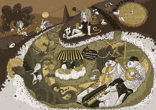
No, I won’t start with a long and useless explanation as I’ve got a 48 words caption for that:
“Did you know Blackheath had its own version of the London Underground? Populated at night by the area eclectic wild life, relaxing, enjoying live music, sharing home made food and beverages, and ultimately getting filled up with positive energy! This is my truth about the forgotten Blackheath Cavern.”
I would just add that I’ve been living in this far far far far far (still) London area that is Blackheath, and it’s been by far the best place I’ve lived in London for reasons that should be experienced by every people living in this city and anybody else. So it became quickly obvious to pick up Blackheath for my next London related illustration.
Now, a step by step of the whole thing!!! This is exciting.
I’m excited.
1. Doodling
My Moleskine and my sofa are my best friends for this first task. I try to keep it open and throw in as many awkward ideas as I can.

Even if Blackheath appears on my first doodle batch I haven’t stick on it much as a lack of “secret” ideas about it. So I opened a window (a browser window) and looked for “facts” about London.
Got few listings of facts as interesting as:
- Undeground escalator length twice as a world round trip every two weeks;
- Tower of London used to be surrounded by vegetables and exotic animals;
- …
I started exploring the Tower of London one but it didn’t go anywhere and I never been to the Tower of London. But I’ve been to Blackheath, did I say that already?
So I searched for facts about Blackheath and found this exciting Subterranean Greenwich and Kent blog post.
I got excited.
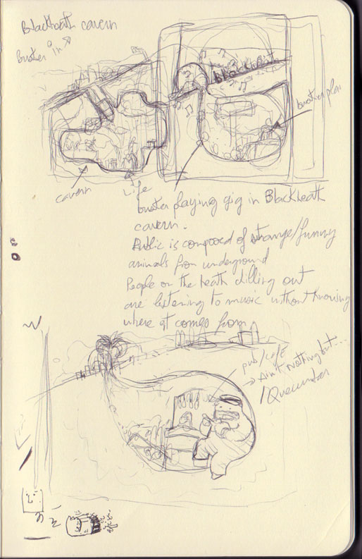
Followed several burst of ideas related to my experience of the area but also my experience of London as a whole.
Doodling madness.
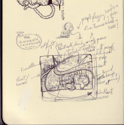
I usually do several tiny “framed” versions of the concept to anticipate the composition, develop few graphical elements, characters and random ideas that will serve as reminders during the sketching.

2. Inspiration board
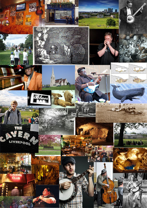
I need visual help. Again, opening a window to the Internet (I try to make it sounds beautiful) is my next job.
Once in a while I’m a jigsaw designer.
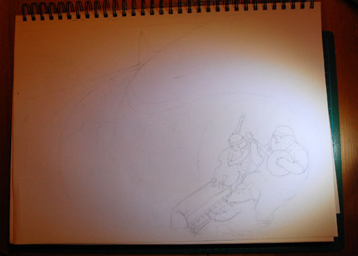
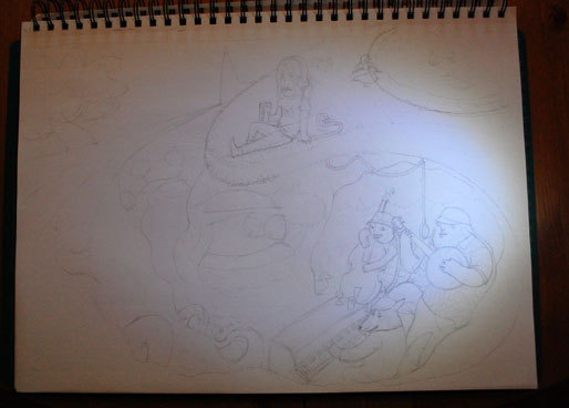
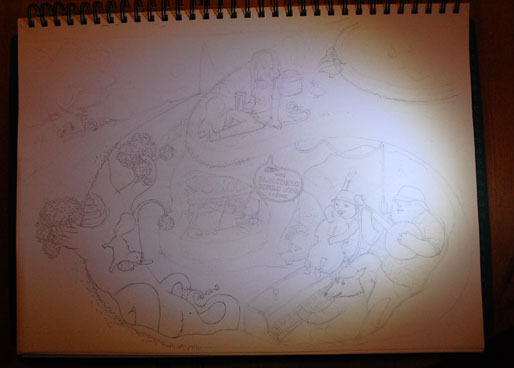
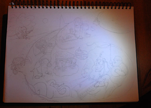
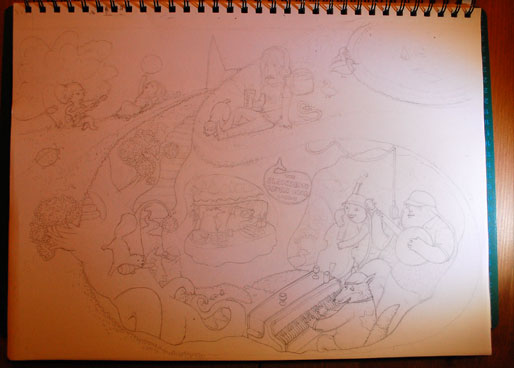
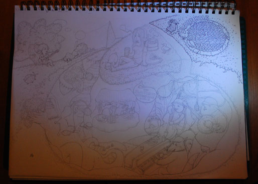
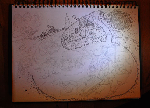
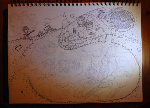
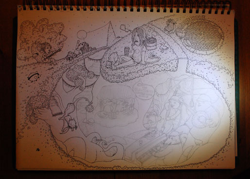
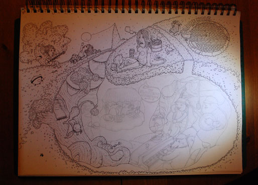
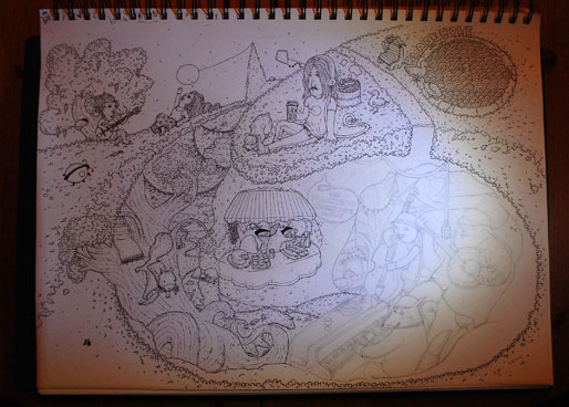
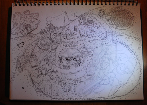
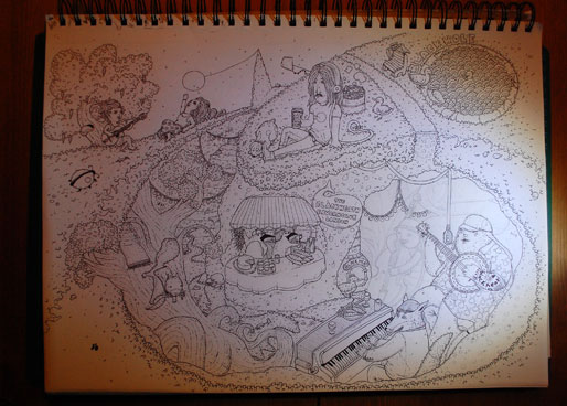
3. Sketching
My hat is up, my pyjama is ready, my pencils are vibrating, it’s business time.
Not much to say other than it pays to be patient, when the initial idea magically appears on something that, late at night, is often more than an A3 sheet of paper.
Emotion.
Time-lapse time.
4. Painting
Back to Suzzy (aka my bamboo laptop).
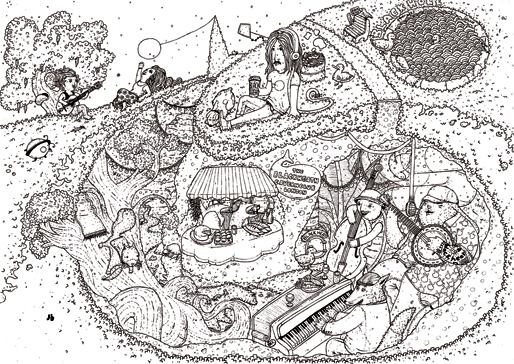
I need to fit this big baby into the machine, but I want the lines crystal clear and not mushy blurry. So, for the scan, I only take pure black and white (nothing in between) and double the resolution (600 dpi) so the final print (300 dpi) will be so bloody razor sharp it stresses See’aim’why’key’ pigments. Insane.

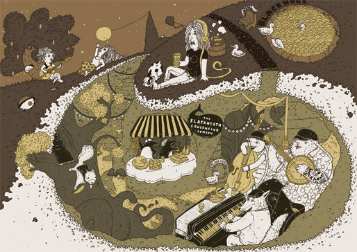
As I used pretty saturated colours for most of my latest illustrations, I challenged my lazy side by starting a personal revolution and opt for a sepia-esque palette, much more “off” than usual. The idea being to give an old-but-new feel to the artwork. Of course, I tried with my common saturated colours and I won’t show it, as it was terrible. Believe me. Terrible.
Then I got used to the colour palette, it started to melt into me and the drawing, and I decided to use white for living things, flashy (but off) yellow for what keeps those living things alive, and differentiate inside and outside the cavern with distinct tints (blue/green).
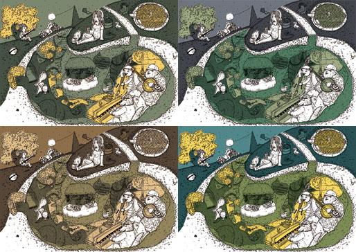
As my lines are far from being straight and clean I can’t paint it in ten minutes using the pain bucket. No chance. So I grab my Wacom pen and I roughly trace the whole thing using vectors and end up with a flat but alive illustration.
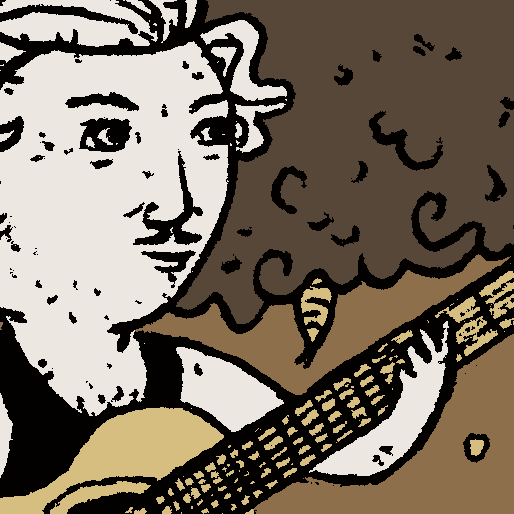
Now, my new thing of 2012: no more black lines.
It makes it lighter, better, stronger, faster. Not faster no, but more beautiful for my tired eyes. Not stronger as well but… well, just look and feel the difference.

Finally, I authorize myself to add to the “Ambiance” with the final touch: the cream (aka the shades).
What’s better than a creamy carousel to illustrate all those highly sophisticated concepts? Nothing.
A last bit to share. One thing I learned during this project is to read a brief carefully: I had the pleasure to realize the artwork should be in portrait format, two days before crossing the finish line. I know. Well, I didn’t but I really should have.
Fortunately it doesn’t seems to prevent of being potentially selected for the exhibition but it won’t go further. Lesson learned.
Voilà.


