Yesterday evening was the tenth and very last session of the course. We had the chance to expose the work we achieved during a showcase where friends and family were invited.I don’t feel like I want to write a lot about this right now – it’s late, I should sleep – but I’m glad to have completed my first ever course in illustration. Just the fact that, for the first time, I had proper hours to draw, has been a sort of revelation really. Last time I used to sketch a lot was when I was student… but during study hours, of course :)
On top of that I’ve also rediscovered the pleasure of traditional drawing, playing with paper textures and various tools. Full digital illustration seems a bit flat now and I don’t even think about my poor Nintendo DS… Still needs Photoshop thought :)
This post is deconstructed but… Anyway it’s 3.30am and it’s all mine!!!
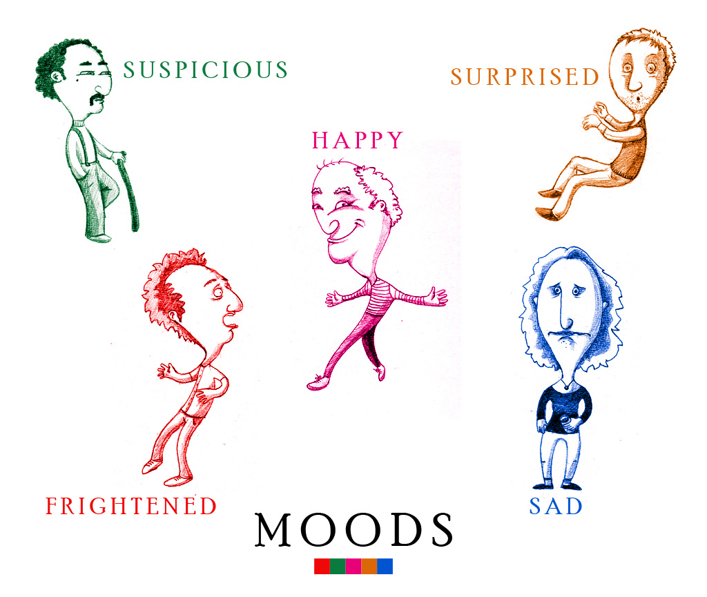
So, during this showcase we had to stick all our work on a huge black sheet of paper. The main piece of work was the final brief of the workshop. Several options were proposed, I choosed to work on opposites: Over/Under. As this was the last project, Dee asked the students to do it as polished as possible. I mean with colours and text, as a finished artwork really. I used the set of Caran d’Ache Supracolor my beloved offered me for my recent Birthday. I love these pencils. There are very very bold and the colours looks fantastic with a large range of hardness (Hope it means something, I’m still French sorry :)) Once the illustrations finished I’ve scanned them, adjusted tone and contrast, added the text in Photoshop and finally printed them on a nice paper. As my printer is A4 I had to shrinked down the drawings by 80% but it even looks better and crisper after that. I’ve been actually very impressed by the printed version. It really helped to make the colours pop out and, well, here they are:
I’ve also cleaned up, retouched and printed some of my previous illustrations:
For me this course as been a very good experience where I learned how to develop characters and ideas and use materials in a proper way. I’d like to thanks Dee Shulman for the great advices and feedback she gave to me and she’s been truly brilliant as animating the classes in a cool and relaxed atmosphear. I really appreciated that especially on Friday evenings! She will do other workshops this summer and next December and yes, I highly recomment them!
For now I’m gonna try to carry on in producing illustration. Maybe not for childrens but I need to keep the productivity up and I want to, so this blog will be my witness.


